


The Power Of Colour In Film: Storytelling Through Chromatics
A cinematic revolution erupted as colour exploded onto the big screen for the very first time almost 100 years ago. Since then, a century of filmmakers have engaged with and harnessed this modern, exciting and vibrant method of storytelling after spending years hidden away in the monochrome shadows. In recent times, the chromatic volume has been cranked up to the max, becoming a key device used for semiotics, expression and entertainment.
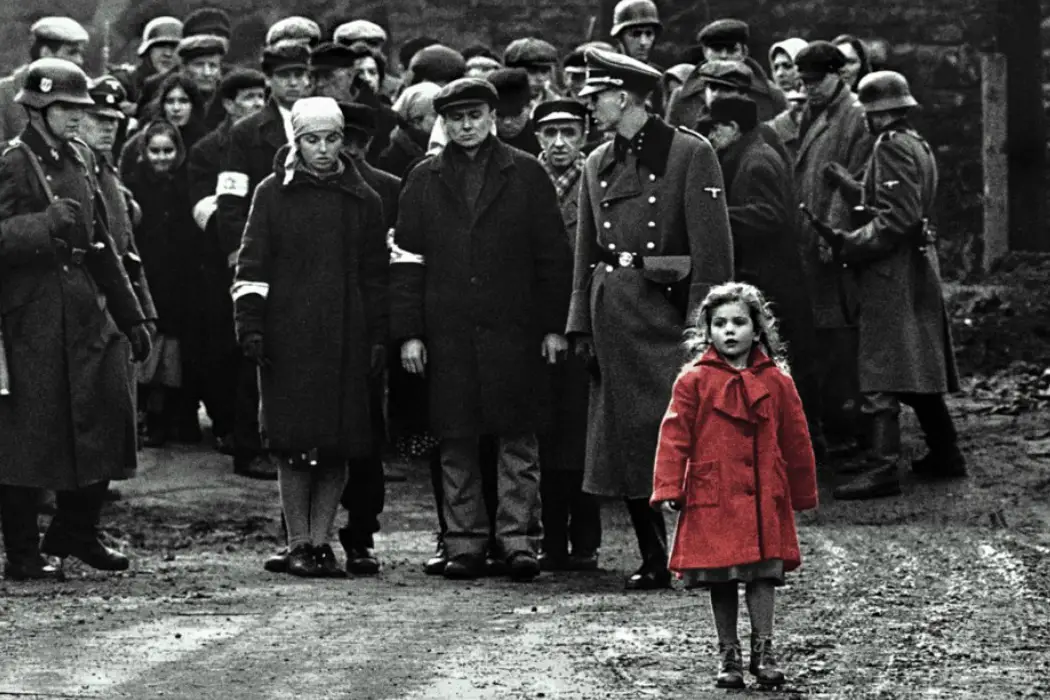
Filmmakers are now able to depict a story with even more exposure and detail, manipulating audiences moods and emotions quite simply through orchestrating colour. Immediate examples of utilising a colour palette for a desired effect can be seen in Schindler’s List – isolating all colours apart from the little girl’s red coat which tugs at the audiences heartstrings, La La Land – where the bold block colours pay homage to old Hollywood musicals (giving the film a joyous vibrancy), and also the Three Colours Trilogy, aptly named, for each exploit in the trilogy contains predominantly blue, white or red, depending on the title. The diverse colour concoctions presented in film take all different shapes, sizes, shades and sharpness, and each palette manages to heighten the cinematic experience in its own unique way.
Psychedelic Technicolour
The psychedelic technicolour colour scheme captures a vibrant, polychromatic world, causing audiences to question if they have just watched a movie or experienced an acid trip. The use of bold colours create multiple onscreen effects. For example, dreamlike wonderlands in Baz Luhrmann‘s pictures; bright colours are everywhere to be seen in these movies, creating fantastical, autonomous settings for the characters and audience.
A cunning way filmmakers use this form of colour scheme to their advantage is by reeling audiences in with a happy, innocent use of vivid technicolour, only to snatch the joy away when the disequilibrium ultimately unfolds. Think about the first 2 minutes of A Series of Unfortunate Events, for example: the film begins with a joyous, childlike sequence presented in an array of colour. This introduction is cut short when the fairy tale music stops, and the image dims to grayscale, revealing the true nature of the narrative. This sudden loss of colour acts as a vacuum, sucking out all the happiness and spinning the story on its head, thus making the bleak events which are about to unravel appear even more morbid.
These outrageously bright and bold films typically do not have an exclusive colour code, for all colours on the colour wheel appear to be existent. However, films like Stanley Kubrick‘s A Clockwork Orange, for example, present some organisation amid the chaos, predominantly utilising the colours on a twister board with an occasional backdrop of black and white. This allows immediate attention to be drawn to specific objects or people within the frame.

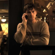
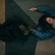
Gaspar Noé‘s movie, mise-en-scène, and as the audience begins to understand the rhythm of Noé‘s colourful language, they start to translate the precise tone in each shot through the dominant colour of the scene.
An example of this is when Murphy names his unborn child. Noé dresses the characters in white, with white bedding and a plain backdrop to portray innocence and purity, the plainness of the scene also connotes the freshness of the relationship between Murphy and Omi, which is relatively new. In each scene, the selected colours come in a variety of intensities, varying from neons and fluorescents to the more shaded and bleaker colours to parallel the intense passion and sadness within the narrative.
Less Is More
This style of palette works under the notion that being consistent with minimal, selective colour creates deeper significance, emitting bolder statements than if multicolour was apparent throughout. Some filmmakers take this approach and only use one colour within a frame, with the rest of the shot in black and white or even sepia tone. Films such as Sin City, 300 and Schindler’s List all use this method. Colour is so sparse in these movies, that it is impossible not to absorb the overt significance of an object or person when it is vividly lit up on screen.
Not all films that take the less is more approach are as exclusive with their colour, but they do use a juxtaposing colour scheme for a pleasing cinematic effect. This type of palette works with two opposite colours to create a clash that is nothing less than compelling. The most iconic examples of this colour scheme can be seen in blockbuster movies such as Skyfall, Transformers and Mad Max: Fury Road, which all include an orange and blue tint. This pairing of colour tends to be the most common due to the complementary effect it has on human skin, magnetising the actors for the audience.

Consider its use in Mad Max: Fury Road: these two colours not only draw attention to the actors, but they also enhance the desperation of all those in the society. The dominant use of orange increases feelings of heat and dehydration, giving the image a Sahara desert-type aesthetic, and a bold blue is used to colour the sky, which acts as a beam of hope (especially for those who are exploited by Immortal Joe and the citadel).
Other examples of colour opposites used on the big screen include yellow and purple (Alfred Hitchc*ck‘s 1958 movie, Vertigo. Not only does Hitchc*ck use the two colours to please the eye, he harnesses their meaning in terms of symbolism: red for danger and green for envy. The colour palette becomes so important and fitting to the narrative that it is immediately recognised when it is absent, making the two colours feel almost like another character within the story.
Muted Pastels
The first name which comes to mind when thinking about this specific colour palette is none other than director Wes Anderson‘s. He is the master of the washed-out, milky aesthetic, which ultimately gives a vintage, nostalgic feeling as if audiences are walking through a fading memory. The Grand Budapest Hotel is probably his most notable film with this colour scheme, as it plays with faded pinks and yellows in an iconic and aesthetically pleasing way. The calming tones allow the farcical story to transpire gently, giving the narrative an overall lighthearted, feel-good aura.
Other films known for their pastel appearance include Her, The Shining and The Virgin Suicides. Generally this colour palette is used to depict innocence and love (The Umbrellas of Cherbourg) or emotional and/or psychological turmoil (Girl, Interrupted), or even both (Edward Scissorhands). The faint colouring often gives off a clinical effect, which is supposedly meant to have a calming affect on institutionalised characters like those in Girl, Interrupted or One Flew Over the Cuckoo’s Nest. In Edward Scissorhands, the colour scheme of the outer world is alien to him as he has been living in darkness for so long, therefore it is representative of a new lease of life and ultimately love when he meets Kim. There is one beautifully washed out film which includes all of these themes (love and innocence, emotional/psychological turmoil) and is not discussed enough, and that is Vincent Gallo‘s 1998 film, Buffalo 66.
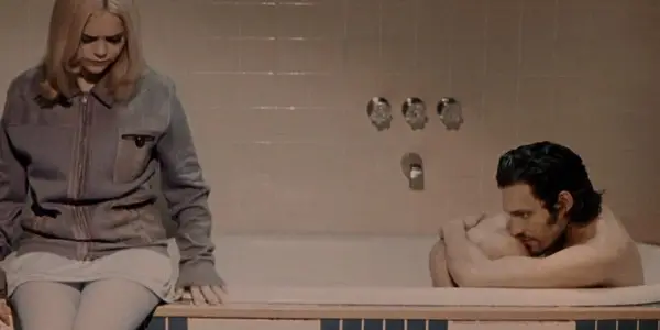
This movie stands out for its simplistic, pastel palette. Its colour scheme makes Wes Anderson‘s aesthetic look fluorescent in comparison. Buffalo 66 uses faint pink, brown and blue in most of its shots to create a look of childish innocence. Gallo consciously breaks the colour scheme when the two pastel dressed protagonists enter public settings like the bowling alley, where he introduces a vibrant red and black environment to reinforce the view that these two characters are ultimately children out of their comfort zones, revoking the initial c*ckiness and tough exteriors shown in previous scenes.
The beauty of having such a muted palette means that when higher saturated colours are introduced, they instantly receive the audience’s attention, thus meaning a close-up shot is not essential for the focal point to shine through; in Buffalo 66, an example of this concept is shown through Layla’s blue eyeshadow and Billy’s red boots. Both characters have a distinct feature that speaks volumes about their personality, and when paired with the movie’s milky pastels, these features truly radiate onscreen regardless of their positioning.
Dark Vs. Light
It’s not difficult to recognise the recurring colour palette in 80% of horror movies; monochrome and/or sepia tone mixed with hot or cold shades of red and blue can create dark and eerie settings resonant of death. It is no surprise to see that films continue to use this archetypal colour scheme, for it adds to the narrative and works incredibly well for the genre. Tim Burton persistently uses the colder version of this red and blue palette in his horror movies such as Sleepy Hollow, Sweeney Todd, Corpse Bride, etc. for the faint, tepid colours he includes stand out due to the noticeable absence of the ones he avoids.
Director David Lynch opts for the warmer, more intense red and blue palette in his neo-noir horrors, incorporating the same colour scheme, but instead increasing the temperature, dressing all of the colour in velvety, vampiric attire, just like in his 1986 film, aptly named Blue Velvet. Not all films, however, abide by this unwritten colour rule within the genre, and instead they heavily increase the vibrancy and choice of colours within the picture to create a less predictable and more psychological thrill.

Prime examples of this brighter, more vivid method include The Masque of the Red Death and Inferno – the sequel to Dario Argento‘s beautifully coloured 1977 film Suspiria. Lighting is just as important as colour in Argento‘s work, and he combines the two to illuminate colour on the screen. Suspiria has an almost neon glow which intensifies the feeling of psychosis not only for the characters, but for the audience, too. Consider the red lighting which washes over the dance academy and in the hallways at night, the glow it gives off makes the entire film fittingly feel like an inescapable nightmare. Argento pairs the iconic red with a chilling blue, and this combination emits contrasting emotions and feelings; ice cold/red hot and calmness/danger. The juxtaposition of semiotics demonstrated through this hybridity of colour and lighting truly messes with the mind.
It can be said that Suspiria demonstrates the most iconic use of expressionist colour in horror film history, and Argento definitely harnesses a variety of colour within this horror, but he predominantly uses blue, red, yellow and pink – similarly to Kubrick‘s A Clockwork Orange – by utilising the primary colours and having them pop against a black and white backdrop (the iconic geometric floor). This only further enforces the ever-increasing feeling of fear and insanity, for Argento reveals that the light can be just as, if not more terrifying than the dark.
Colour: Conclusion
The importance and brilliance of colour in film cannot be stressed enough. Directors and cinematographers are consciously including or avoiding specific colours to deepen narratives while simultaneously enhancing a picture’s overall quality and beauty. These coloured worlds reel in audiences and can shape a filmmaker’s body of work, strengthening their overall oeuvre by acting as a trademark such as Wes Anderson and Nicolas Winding Refn‘s feature films.
Colour has the amazing ability to grab the audience’s attention, foreshadow information and control or influence emotion consciously and/or subliminally. In the 70’s, colour film and television became the norm, and an entire generation has grown up without being deprived of the gift that is coloured cinema – although now a normality, its power and potential should not be taken for granted. A millennial could consider colour palettes in film to be on par with the necessity of filtering an Instagram photo. Who doesn’t manipulate colour in this day and age?
Which movies do you love for their striking use of colour? Share your thoughts and comments!
Does content like this matter to you?
Become a Member and support film journalism. Unlock access to all of Film Inquiry`s great articles. Join a community of like-minded readers who are passionate about cinema - get access to our private members Network, give back to independent filmmakers, and more.